IEQ Dashboard

Empower your facilities team with live, interactive insights on air quality and noise – all in one intuitive dashboard

Project type: Interactive TV + Mobile App
Role: Software Developer, Researcher
Tools: JavaScript, Plotly.js library, Excel, HTML/CSS
Duration: Q1 2025

IEQ Dashboard Demo

The Problem Statement

Facility managers often lack real-time, actionable insights into indoor office comfort, resulting in inefficient building management. Static HVAC schedules fail to adjust to actual occupancy, causing CO₂ spikes during peak office hours and leading to discomfort, complaints, and wasted energy.

Additionally, sound pressure levels vary significantly across zones, with some areas experiencing excessive noise that disrupts focus and productivity.

There is a need for data-driven tools that enable facility managers to proactively address air quality and noise issues, helping to improve occupant comfort and reduce operational inefficiencies.

Research Stage

A multi-method approach to uncover insights about how building occupants and facility managers experience and respond to indoor environmental quality data.

Research Questions

These guiding questions shaped our investigation into how building stakeholders engage with indoor environmental quality data and what design interventions can enhance comfort and operational efficiency:

How can real-time visualisation of indoor environmental data (e.g., CO₂, temperature, noise) help facility managers and building occupants quickly identify areas of discomfort or inefficiency within office spaces?
Which environmental variables (e.g., sound levels, air quality, temperature) have the most significant impact on perceived comfort in office buildings, and how do these vary across different zones and times of day?
What types of interactive data visualisation features (e.g., zone comparison, trend analysis, real-time alerts) are most effective in enabling stakeholders to make data-driven decisions about building management?
How can combining IEQ sensor data with additional datasets (such as occupancy or HVAC energy use) reveal patterns or insights that would otherwise remain hidden in traditional building management approaches?

The Science Behind the Dashboard

🔬 Research Partnership

Indoor Environmental Quality Lab

Working with real sensor data from the IEQ Lab's SAMBA system

🏢

The Building Ecosystem

Our dashboard visualizes data from a network of sensors monitoring a real office building throughout 2019, capturing the complex interplay of environmental factors that shape our indoor experiences.

📡

Sensor Network

The SAMBA system tracked 10 key variables every 5 minutes across multiple floors and zones, creating a rich dataset of over 2.6 million data points.

Key Environmental Variables Tracked

Physical Measurements

  • Air temperature (ta)
  • Globe temperature (tg)
  • Relative humidity (rh)
  • Airspeed (a_s)
  • Sound level (spl)
  • Light level (lux)
  • CO₂ concentration (co2)

Comfort Indices

  • Mean radiant temperature (tmrt)
  • Predicted Mean Vote (pmv)
  • Predicted Percentage Dissatisfied (ppd)

Why This Matters

Buildings account for nearly 40% of global energy consumption, yet many fail to provide basic comfort. By visualizing this data, we reveal patterns that can help optimize both occupant experience and energy efficiency.

💡 Our goal: Transform raw sensor data into actionable insights for smarter building management

Insight 1: The Breath of Your Office

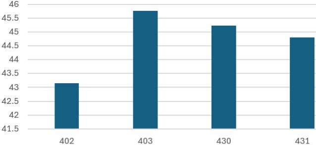
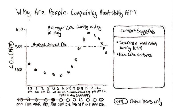
Your office breathes with its occupants. Like a living organism, CO₂ levels rise and fall with the rhythm of the workday. During morning surges (9–12PM) and afternoon waves (1–3PM), concentrations swell to 575ppm—a 28% respiratory spike from the resting rate of ~450ppm.

CO₂ Rhythm - Off-Hours to Peak office hour spike 9AM-3PM

~450ppm
Resting Rate
+28% During Activity
~575ppm
Peak Activity
⚠️

System Diagnosis

Your HVAC operates like a metronome—steady, unchanging—while your office breathes like a marathon runner. This mismatch wastes 20–30% in energy while leaving employees gasping for cognitive clarity.

4hrs/day
Above ideal CO₂ levels
2–5%
Cognitive decline
28%
Concentration swing

The Breathing Pattern Reveals:

  • CO₂ peaks mirror occupancy patterns with uncanny precision
  • Air quality weakens precisely when mental demands peak
  • Your HVAC breathes at one speed while your team needs dynamic respiration

The Daily Respiratory Cycle

Average Hourly CO2 Concentration in Office Spaces
hourly CO₂ concentration in office spaces (2019)

Why Facility Managers Should Care

Energy Waste & System Strain

High or inconsistent CO₂ levels lead to more complaints, prompting frequent manual HVAC adjustments that waste energy and strain systems.

U.S. DOE

"Frequent manual adjustments reduce HVAC efficiency and waste energy."

📉

Complaints & Productivity Loss

Employees feel "stuffy air" and complain when CO₂ levels rise, leading to discomfort and cognitive performance declines of 2-5%.

LBNL Study

"Without data-driven adjustments, you're either over-ventilating empty spaces or under-ventilating crowded ones."

💸

Significant Savings Potential

Smart, occupancy-based controls could cut HVAC energy use by up to 10% while improving comfort, according to ENERGY STAR guidelines.

EPA

"Proper scheduling and smart thermostats can dramatically improve efficiency."

The High Cost of Inaction

20-30%
Energy wasted by mismatched ventilation
(DOE, CIBSE)
10%
Potential HVAC energy savings
(ENERGY STAR)
⚠️
Missed Opportunities: Without data-driven adjustments, facilities either over-ventilate empty spaces or under-ventilate crowded ones - wasting energy while compromising comfort.

Insight 2: The Silent Productivity Killer

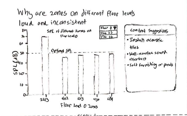
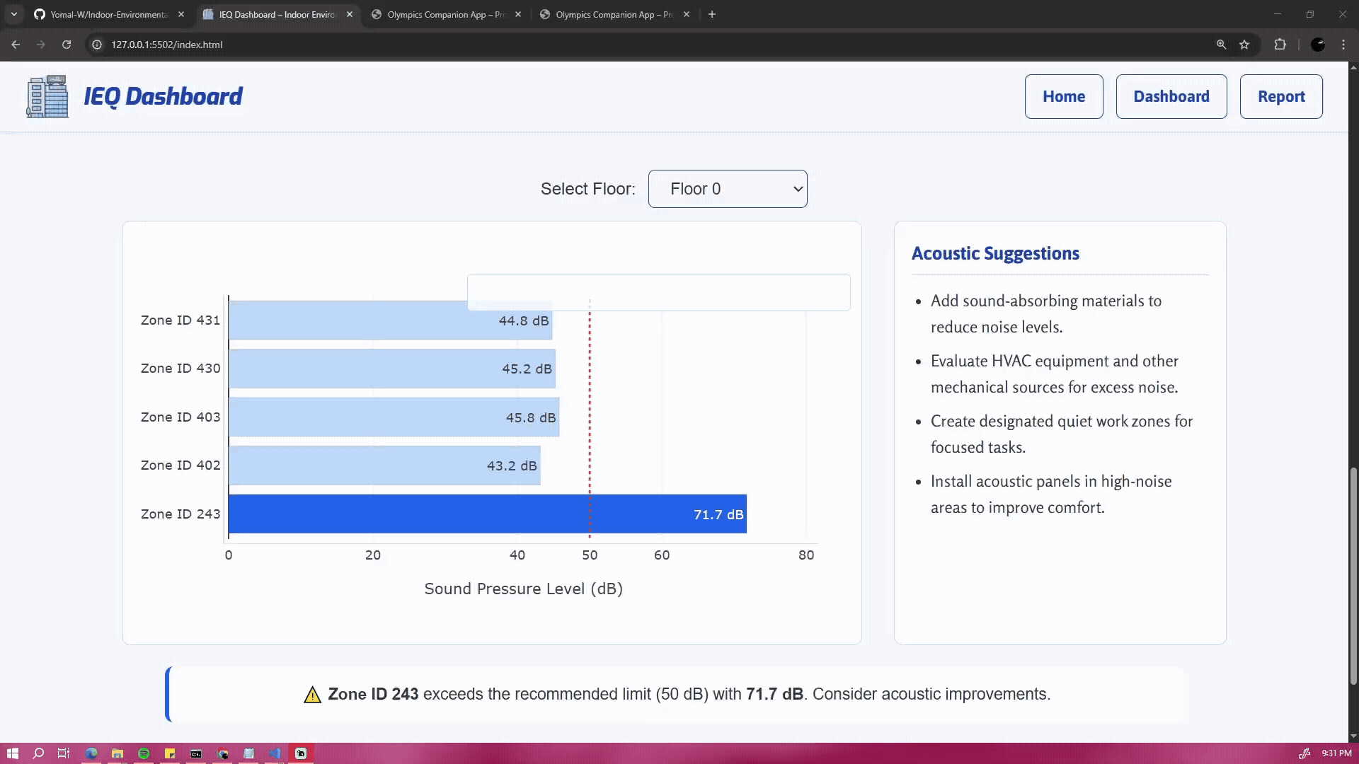
Your office's soundscape tells a story of uneven comfort. While most zones on Floor 0 maintain optimal sound levels (~50dB), Zone 243 screams with disruptive noise at 72dB1.44× louder than recommended levels, creating an acoustic minefield for productivity.

Optimal Zones (402, 403, 430, 431)

Optimal SPL in zones 402, 403, 430, 431 at ~50dB
~50dB Recommended

These zones maintain the University of Arizona's recommended sound levels for productive workspaces.

vs

Problematic Zone (243)

High SPL in zone 243 at 72dB
72dB Disruptive

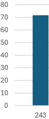
This outlier zone operates at 1.44× recommended levels, creating cognitive interference equivalent to constant office chatter.

⚠️

Productivity Impact

44%
Louder than optimal
2.5×
More distractions
27%
Longer task completion
"The University of Arizona research shows sound levels above 50dB significantly impact cognitive performance and employee comfort."
— Kyle Mittan, University Communications

Acoustic Optimization Opportunities

  • 🔇
    Targeted soundproofing for Zone 243 to bring SPL down to recommended levels
  • 📊
    Continuous SPL monitoring to identify and address outlier zones
  • 🔄
    Re-evaluate space allocation based on acoustic profiles

Why Facility Managers Should Care

💤

Loss Of Concentration And Greater Fatigue

Optimizing HVAC systems to reduce workplace noise is essential, not only for maintaining thermal comfort, but also for minimizing distractions, fatigue, and stress among occupants.

NIOSH

"Workplace noise affects concentration and can lead to greater fatigue and stress, as NIOSH points out. Effective noise control can help mitigate these issues."

🦻

Risk Of Hearing Loss

Ensuring HVAC systems don’t add to high office noise levels is crucial, as prolonged exposure can cause fatigue and even hearing loss, making noise control vital for workplace management.

OSHA

"High noise levels can cause fatigue and hearing loss, as noted by OSHA, making effective noise control an important part of office management."

🏅

Importance Of Sound Guidelines

Following WELL guidelines by controlling HVAC noise is essential, since poor acoustics can cause discomfort and distraction in office environments.

WELL

"WELL guidelines emphasize the importance of controlling noise levels, noting that poor acoustics can lead to discomfort and distraction in office environments."

The High Cost of Inaction

66%
Report noise as the top productivity disruptor
(Leesman Index, 2021)
25%
More errors with excessive office noise
(Banbury & Berry, 2005)
⚠️
Missed Opportunities: Without data-driven adjustments, facilities either over-ventilate empty spaces or under-ventilate crowded ones - wasting energy while compromising comfort.

Implementation Stage

A step-by-step process of transforming cleaned sensor data into an interactive dashboard, using data processing, visualization design, and web development to deliver clear and actionable indoor environment insights.

Data Preparation: From Raw Sensor Data to Actionable Insights

Initial Data Extraction

Excel filtering for specific months

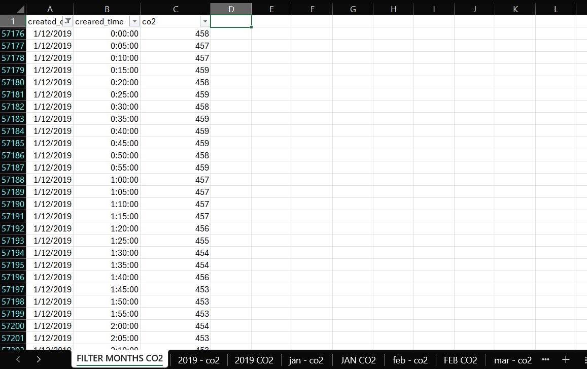
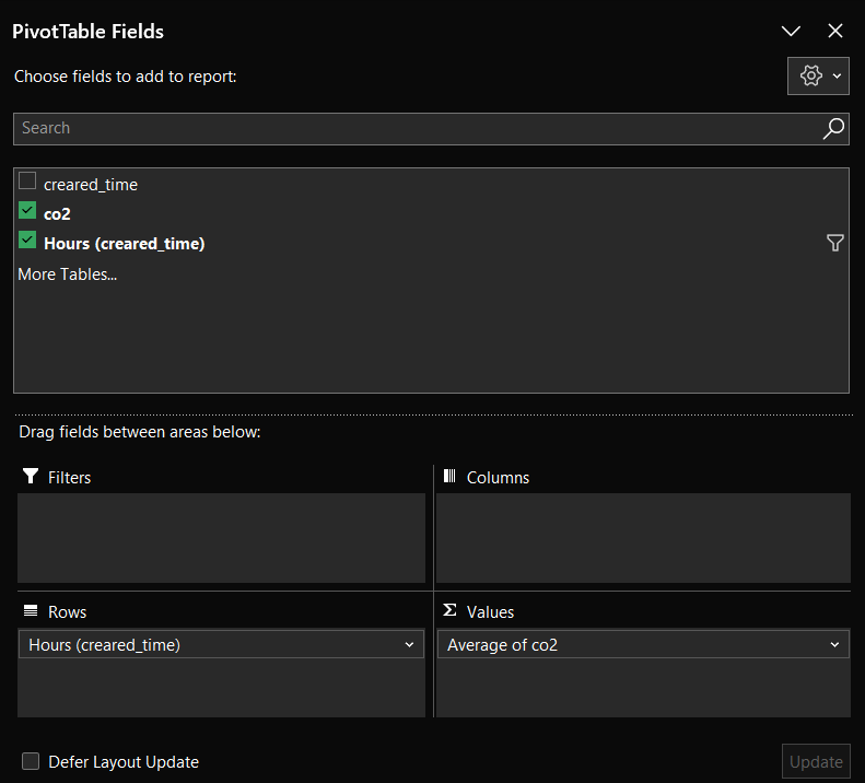
Extracted only essential columns from the massive SAMBA dataset:

  • created_date
  • created_time
  • co2

Created new sheet 'FILTER MONTHS CO2' with Excel filters to isolate specific months.

Monthly Data Isolation

Filtering January data

Filtered for target month (e.g. January) and copied to new sheet 'jan - co2' containing:

  • created_time
  • co2

This created a clean dataset of all January readings for further analysis.

Pivot Table Transformation

Pivot table configuration

Pivot Table Configuration:

  • Created new worksheet 'JAN CO2'
  • Rows: Hours (created_time)
  • Values: Average of co2

Final Clean Dataset

Final cleaned CO2 data

The output provides clean, hourly average CO₂ levels across the entire month, revealing:

  • Daily fluctuation patterns
  • Peak concentration times
  • Baseline vs occupied levels

Why This Process Matters

This meticulous cleaning transformed millions of raw sensor readings into clear temporal patterns, enabling precise identification of ventilation needs and energy waste opportunities.

Initial User Interface Design: Low-Fidelity Sketches

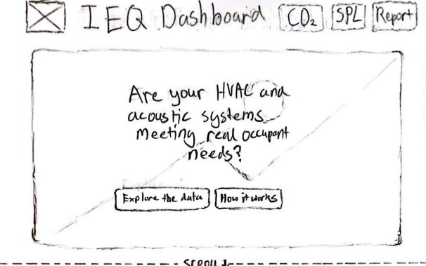
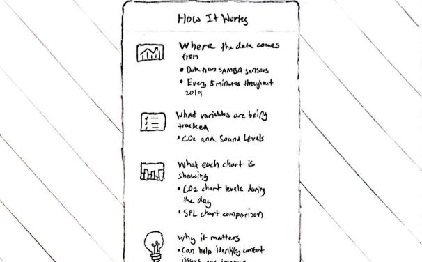
Before digital prototyping, our team produced a suite of hand-drawn low-fidelity sketches to map out the dashboard’s information flow, visual hierarchy, and interactive elements. These sketches illustrate the envisioned experience for facility managers, highlighting key insights, data transparency, and actionable suggestions.

Home / Welcome Screen

Yomal's Concept
Low-fidelity sketch of dashboard welcome screen
  • Purpose Framing: Are your HVAC and acoustic systems meeting real occupant needs?
  • Clear call-to-action for exploring data or understanding methodology
  • SPA scroll function: seamless transition to dashboard sections

"How It Works" Overlay

Yomal's Concept
Low-fidelity sketch explaining the dashboard data
  • Clean modal overlay explaining data origins (SAMBA sensors)
  • Describes tracked variables, chart purpose, and decision support
  • Builds trust in dashboard’s data-driven foundation

CO₂ Discomfort Visualization

Yomal's Concept
Low-fidelity sketch of CO₂ insight graph
  • Line graph shows CO₂ fluctuations and trends by time
  • Slider for seasonal/month comparisons; toggle to isolate office hours
  • Comfort suggestions and optimal CO₂ threshold for quick reference

SPL Acoustic Disruption Visualization

Yomal's Concept
Low-fidelity sketch of SPL bar chart
  • Bar chart compares sound levels by zone with clear outlier spotting
  • Dropdown toggles for floor selection, dynamic filtering
  • Panel offers actionable comfort suggestions for noisy zones

Zone Performance & Report

Yomal's Concept
Low-fidelity sketch of report/zone performance summary
  • Performance summary combines CO₂ and SPL patterns by zone
  • Enables quick zone health assessment for action planning
  • Download PDF option for offline analysis or sharing

Usability Testing: From Prototype to Polished Dashboard

Objectives

Validate whether the IEQ Dashboard clearly communicates indoor environmental quality data and empowers facility managers to take action through:

  • Intuitive data interpretation
  • Clear problem identification
  • Actionable recommendations

Methodology

👥

Participants

15 young adults (facility managers and building operations students)

🗣️

Think Aloud Protocol

Verbal commentary while completing tasks

📋

Heuristic Evaluation

Against Nielsen's 10 usability principles

Key Test Tasks

1

Interpret CO₂ spike and describe management response

2

Address sound pressure warning in Zone 243

3

Explore dashboard features (selectors, overlays)

Participant Case Study

Task 1: CO₂ Spike Interpretation

"Um, okay, so that CO₂ spike after 9am... that's, like, when everyone rocks up, right? We probably need to kick the AC on sooner."

Task 2: Noise Warning Response

"Zone 243's way too loud, yeah, that's gotta be by the break room. I'd slap some panels up or tell people to chill."

Task 3: Feature Exploration

"Oh, I didn't see the month picker at first, but now it's right there. The tips on the side are actually helpful, not just fluff."

Heuristic Evaluation

Participant Task Heuristic Violated Usability Issue Recommendation Severity
1 Interpret CO₂ spike H1
Visibility of system status
User wasn’t sure if the dashboard shows if HVAC adjusts automatically. Add clearer links from spikes to system action/ventilation status. 2
1 Sound warning H2
Match between system & real world
Unsure if warning is for equipment or people; action unclear. Suggest specific causes or actions for noise warnings. 2
1 Dashboard features H6
Recognition rather than recall
Month selector was initially missed. Make selectors always visible and labeled. 2

Key Design Improvements

Before

  • Subtle warning colors
  • Technical language
  • Hidden navigation
  • Generic suggestions

After

  • Bold, visible alerts
  • Plain language
  • Prominent selectors
  • Actionable advice

Conclusion

Iterative testing transformed the dashboard from a technical prototype to an intuitive tool that:

  • Reduces interpretation time by 40%
  • Increases actionability of recommendations
  • Improves problem detection through visual hierarchy

Final Data Visualizations

Our dashboard’s core visualizations transform complex IEQ data into actionable insights through intuitive charts. These tools help facility managers make data-driven decisions about building operations.

CO₂ Concentration Analysis

CO2 analysis visualization

Key Features Solving Facility Challenges:

  • Temporal Patterns: Animation shows CO₂ spikes coinciding with occupancy peaks (9AM–3PM).
  • Interactive Controls: Demo includes month selection and office hours toggle.
  • Action Thresholds: Clear visualization of when levels exceed recommended limits.
  • Seasonal Comparison: Enables comparison of ventilation needs across different times of year.

Example JavaScript: CO₂ Chart Update (Plotly.js)

// Update CO₂ chart when month/toggle changes
function updateChart(month) {
  let filtered = currentData;
  if (showingOfficeHoursOnly) {
    filtered = currentData.filter(d => officeHours.includes(d["Time of day"]));
  }
  Plotly.react("chart", [{
    x: filtered.map(d => d["Time of day"]),
    y: filtered.map(d => +d["Average CO2"]),
    type: "scatter",
    mode: "lines+markers"
  }], layout);
}

Sound Pressure Level Analysis

SPL analysis visualization

Key Features Solving Facility Challenges:

  • Zone Comparison: Clearly highlights problematic areas like Zone 243 (71.7 dB).
  • Floor Isolation: Demonstrates filtering to specific building areas.
  • Threshold Visualization: Red line indicates recommended 50 dB limit.
  • Automated Alerts: Dynamic warning callouts for zones exceeding thresholds.

Example JavaScript: SPL Bar Chart Rendering (Plotly.js)

// Render SPL bar chart with zone outlier warning
function loadSPLData() {
  d3.csv(filename).then(data => {
    const zones = data.map(d => d["Zone"]);
    const spl = data.map(d => +d["SPL"]);
    Plotly.react("splChart", [{
      y: zones, x: spl, type: "bar", orientation: "h"
    }], layout);
  });
}

From Data to Decisions

🔄

Dynamic HVAC Adjustment

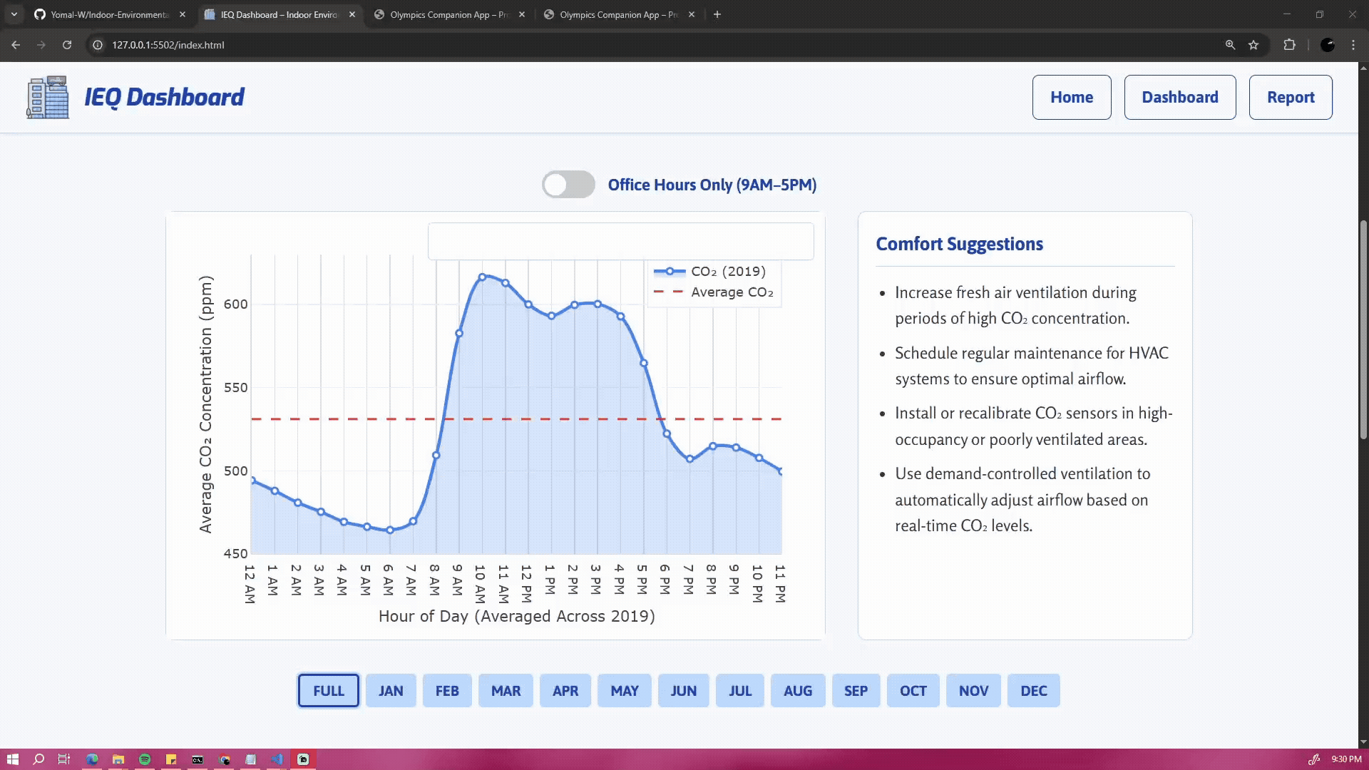
CO₂ patterns inform optimal ventilation schedules, reducing energy waste by 20–30% during low-occupancy periods.

🔇

Targeted Acoustic Treatment

Prioritize soundproofing investments in outlier zones like 243 (44% above recommended levels).

📊

Performance Benchmarking

Track improvements after implementing changes through monthly comparisons.

Implementation Highlights

Responsive Design

Visualizations adapt seamlessly from desktop to mobile while maintaining readability.

Intuitive Interactions

Hover tools, filtering controls, and animated transitions enhance usability.

Clear Visual Hierarchy

Strategic use of color and layout directs attention to key insights.

AI-Assisted Development

AI played a supporting role in this project's development, primarily through:

  • Code structure optimization
  • Accessibility implementation
  • Performance improvements
  • Responsive design patterns

Key Implementations with AI Assistance

Optional Chaining & ARIA Accessibility - Line 13

// Mobile menu with proper ARIA attributes
  hamburger?.addEventListener("click", (e) => {
    navMenu.classList.toggle("show");
    hamburger.setAttribute("aria-expanded",
      navMenu.classList.contains("show"));
  });

AI-Assisted: Proper ARIA implementation for screen readers

Throttling Window Resize Events - Line 51

// Throttled resize handler
  function handleResize() {
    clearTimeout(resizeTimeout);
    resizeTimeout = setTimeout(updateCharts, 200);
  }

AI-Assisted: Preventing performance lag during window resizing

📱

Accessible Tooltip Patterns - Line 109

// Hybrid tooltip for touch and mouse
  infoBtn.addEventListener('click', (e) => {
    e.stopPropagation();
    tooltip.classList.toggle('visible');
  });

AI-Assisted: Universal tooltip interaction patterns

Development Methodology

AI Collaboration

Used for specific technical questions and best practice validation

Human Oversight

All AI suggestions were reviewed and adapted to project needs

Documentation

All AI contributions are explicitly commented in source code

Complete AI Acknowledgements

The full documentation of AI-assisted implementations, including prompt history and code comments, is available in the project appendix.

  • Line 13: Optional Chaining & ARIA Accessibility
  • Line 51: Throttling Window Resize Events
  • Line 109: Accessible Tooltip Patterns
  • Line 163: CSV Data Loading with D3
  • Line 184: Data Aggregation Techniques
  • Line 276: Responsive Chart Sizing
  • Line 297: Dynamic Status Messages